Working with Analogous Colors
Just as complementary color combinations can create pop and drama, analogous combinations can create a calming palette. But calm does not mean boring and it does not necessarily mean simple.
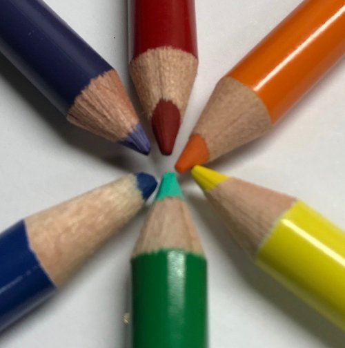
While complementary colors are two colors on the opposite sides of the color wheel, analogous colors are next to each other on the color wheel. An analogous palette is similar to a monochromatic one, (different shades or tones of the same color) but can have a more sophisticated look and offer more creative options.
It’s easy to identify (or create) an analogous grouping because the colors will have a common element. The color in the center of an analogous group
of three is sometimes called the mother color, since the other two colors contain that center color. For instance, on the color wheel, blue’s closest neighbors are blue-violet and blue green. Basically, the primarily color combined with the adjacent secondary colors. Therefore, red’s analogous neighbors are red-orange and red-violet, yellow’s are yellow-orange and-yellow green.
.jpg)
Of course there are nearly endless variations on these. There are any number of blue-violets depending on proportions, tones and values of each color. The closer the color leans toward the blue, the more harmonious it will be when paired with a pure blue element. As with complementary color mixes, an analogous palette it’s best to have a dominant color. Even in a harmonious mix, the eye prefers a clear pecking order or visual path. Just pop of a neighboring color can create some visual texture to a palette without shaking things up too much.
Another way to create a visually complex analogous mix is to mix warm and cool tones. Warm tones contain more yellow while cool colors contain more blue. In general, the colors from violet to yellow-green on the color wheel are cool colors. From red-violet to yellow are warm. But things get more interesting when you look into the warmer cools and cooler warms.
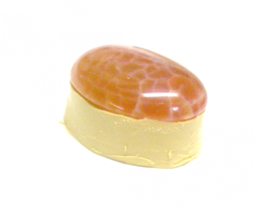
Analogous mixes to try: Pink crazy lace agate, cherry quartz and rosy quartz; goldstone, carnelian and yellow jade; malachite, African turquoise and yellow
turquoise.
Or some warm/cool color crystal combinations:
light sapphire + aquamarine
topaz + fuschia
peridot + emerald
When designing with analogous colors, there are a few other color terms/qualities that are useful to know:
• Tint: A paler version of a color
• Shade: A darker version of a color
• Tone: A more subdued version of a color
• Value: A color’s lightness or darkness
• Saturation is the degree of a color’s intensity. Adding white, black or gray desaturates a color.
If you were painting, rather than beading, you’d make a blue tint by adding white. You’d make a shade by adding black and a tone by adding gray. If you were
“painting” with beads or wire, obviously you’re not going to add black, white or gray to the them (unless you ARE painting your elements, but that’s a different article).
But you can make a DESIGN more or less saturated by adding, different shades, tints or tones of your principal color. For instance you can add sky blue, navy blue or Prussian blue to pure blue make the design subtler. Similarly, mixing analogous colors (any of the variations of blue violet and blue green) to pure blue may lessen the individual impact of the blue, but at the same time increase the power of the design as a whole by adding complexity and visual layers.
.jpg)
Materials

13 Piece Autumn Jasper Collar Set - Pack of 1
A2-1999R
- Lesson Quantity: 1.00 pieces
- Purchase Quantity: 1.00 each
- Price: $3.57
- Gold Club Price: $2.68

13 Piece Red Jasper Collar Set - Pack of 1
A2-1995Q
- Lesson Quantity: 1.00 pieces
- Purchase Quantity: 1.00 each
- Price: $3.57
- Gold Club Price: $2.68

4mm Topaz 5328 Bi-Cone Swarovski Crystal Beads - Pack of 10
A13-65A
- Lesson Quantity: 1.00 pieces
- Purchase Quantity: 1.00 each
- Price: $1.97
- Gold Club Price: $1.48

Other Bead Options

Colorful Cabochons
Tools

WireJewelry - Ultimate Wire-Pliers Jewelry Pliers with Case, Set of 5
G15-20
- G15-20
- Lesson Quantity: 1.00 pieces
- Purchase Quantity: 1.00 each
- Price: $170.72
- Gold Club Price: $128.04

Bench tools
- Category: Design
- Technique(s): Design



 Working with Complementary Colors
 Working with Split Complementary Colors
 Color Inspiration - Cool Blues and Greens
 Designing with Neutral and Universal Colors
 Mixing Color with Metal
 Wrapped Loops Beyond the Basics
