- NEW DVD Series – Stone Setting with Bezels
- Tube Set Charm by Kim St. Jean
- Prong Basket Pendant by Kim St. Jean
- NEW DVD Series – Stone Setting with Cold Connections
- New DVD Series – Stone Setting with Wire
- NEW DVD Series: Introduction to Stone Setting by Kim St. Jean
- Featured Tool: Bracelet Bending Plier
- NEW Dvd by Eva Sherman
- Fun, Fast Fold Forming DVD Series
- Double Band Ear Cuff from Alex Simkin
How to Edit a Jewelry Picture Using Photoshop
Editing a Picture in PhotoShop
By Mike Ault
So, you have used a light box and lights, set the camera for the proper exposure, white balance and such, used a tripod and your picture still comes out like figure 1.
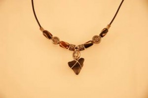
Figure 1: Raw Picture from Camera
What can you do? Well, I use PhotoShop 5.5. other editors are gimp on Linux and PhotoShop Elements (and many others) which all allow adjustment of the photo in the areas of color balance, sharpness and levels.
So I load the image into PS5.5 and end up with what you see in Figure 2. Immediately do a “Save As” and save the photo under a different name, this prevents you editing the original.
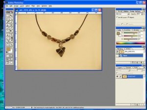
Figure 2: Photo Loaded in PhotoShop 5.5
First things to look at are:
- Do you need to crop?
- Do you need to cleanup stray lines, dust artifacts or other items?
In the above photo, I do not need to crop and at least for now there are no dust, scratches or other artifacts to cleanup. So now what do I do about the non-white background? I assure you, this was taken against a white background so how do I get it back? The answer is levels. Look at figure 3, it shows navigating the menus (Image, adjust, Levels) to get to the levels adjustment window. The Levels adjustment window is shown in Figure 4.
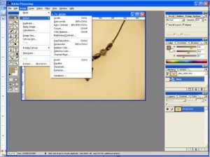
Figure 3: Menu Path to Adjust Levels
(Note: For Quick and Dirty try the “Auto Levels” item, it may do just great or it may not)
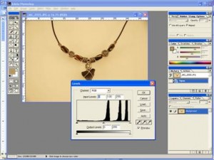
Figure 4: Levels Adjustment Window
Notice the histogram, under it there are three tiny arrows, one on the left, one center and one on the right. These arrows are used to adjust the “levels” in the image. You can manually shift them back and forth by using the cursor to select one, hold down the mouse left click and sliding it where you want to go. First, let’s adjust the “white” setting.
In our picture white will be easy, examine the non-necklace area, all of it is white, find the area that looks lightest. Now, using the mouse cursor, select the left hand arrow and slide it all the way to the right. Next, use the cursor to select the right hand eye-dropper. Move the eye-dropper to the area you decided was most “white” and then click the left hand mouse button. Just before I clicked on the left hand mouse button I captured Figure 5.
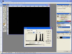
Figure 5: Left slider all the way right, eye-dropper is in mid lower-left quadrant
Once you click the image should reappear with the background reset to be white. See Figure 6.
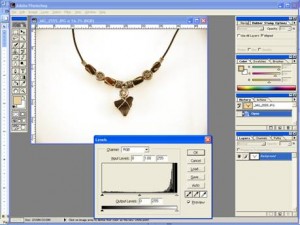
Figure 6: White Balance has been reset
Now, if there are some colors still off, you can try setting “Black” as well a “White”. To set black first determine where the best “black” is in the picture. I usually move the Levels window so a corner points to it before the next step as in figure 7.
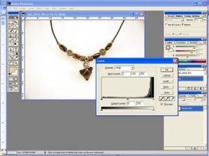
Figure 7: Upper Left Corner on Best Black
Next, select the right most slider and move it all the way left. Then select the leftmost dropper and place it on the black selection and click. Figure 8 shows the image just before clicking on the dropper.
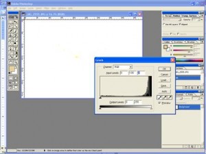
Figure 8: Just before selecting “Black”
Figure 9 shows the affect of setting Black on our image. Note that at anytime should the results not be what you want, you can use a CTRL-Z to eliminate previous steps.
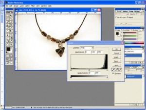
Figure 9: Image after selecting “Black”
Once you are satisfied, click on “OK”.
Now, is the image as sharp and clear as you would like? Or is it a bit soft? I usually like to use an unsharp mask to clean up the image a bit and really bring out the details. The Unsharp Mask is on the Filters, Sharpen, Unsharp Mask menu trail as shown in Figure 10.
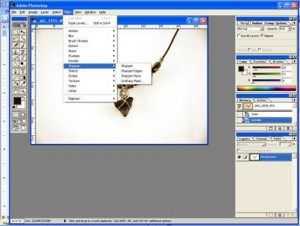
Figure 10: Unsharp Mask menu Path
Click on the Unsharp Mask menu item and the Unsharp Mask Adjustment Window will appear. Note that all changes to settings will be shown live on your image as they occur. Figure 11 shows the Unsharp Mask controls.

Figure 11: Unsharp Mask Controls
Notice we are currently set at Amount 32%, Radius 5.0 pixels and Threshold 9 levels. Usually radius doesn’t have to be set more than 10 and threshold more than 12. I usually use 5 and 9 for jewelry. The one control that you will probably want to adjust is the Amount control. In the Image above it is set to 32, look at the difference in Figure 12 with it set to 132.
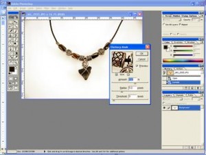
Figure 12: Amount set to 132%
See how the lines look crisper and the silver, well, looks more silver! However, beware! Over sharpening can result in curved lines getting jaggy and the halo effect against colored background. Tweaking the settings gives me an optimal sharpness with minimal jaggies and halos at about 114% as shown in Figure 13.
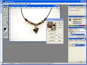
Figure 14: Nominal setting at 114%
Once you get the image as sharp as you want, click on OK to return to the normal screen.
Ok, we have adjusted white and black (levels) and sharpness. However, the image still seems a bit dull, let’s look at brightness. Figure 15 shows how to get to the Brightness/Contrast controls.
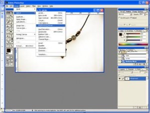
Figure 15: Brightness/Contrast menu path
The Brightness and Contrast ion PhotoShop consist of two sliders, one for brightness and one for contrast. Simply use the mouse and left click to select the control and move it back and forth to get the desired change. I want to increase brightness slightly then adjust contrast to keep details sharp. In this case I increased brightness by +29 and upped contrast to +8, see Figure 16.
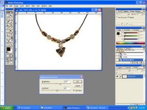
Figure 16: Brightness and Contrast Adjusted.
Now, with the brightness adjusted, notice that we are getting vignette effect (slight darkening) in the corners. If you like that effect, leave it, if you want to eliminate it, or any other defect such as a dust mark, scratch or unwanted background line, use the clone/stamp tool (it looks like an old rubber stamp on the tool bar. See Figure 17.
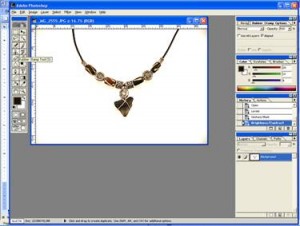
Figure 17: Stamp/Clone tool selection
First, make sure your “brush” selection is the proper size to clone just the area you want, too small and you can get artifacts, too large and it can be hard to get just what you want. You do this with a right mouse click. Next, place the stamp brush indicator (usually a circle) over the area you want to clone from and push the ALT-click combination to tell the tool to take pixels from the target and use them overlay where you tell it. Then move the brush indicator to the target area and simply click to paint over the target. The source area will move with the target area once you start clicking so be careful not to accidently clone something in the general source area as you move around. In Figure 18 I have cloned out the upper right hand corner to make it uniformly white.
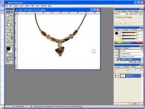
Figure 18: Upper Right Hand Corner Fixed (not clone brush)
Figure 19 shows the final picture with the corners corrected.
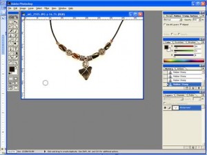
Figure 19: Corners corrected, final image
Now, using a white background you won’t get much reflection and sometimes you want that. If you want reflections then use a colored sheet behind the glass stage area. Figure 20 shows the before and after image.
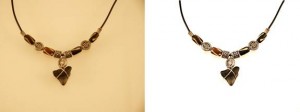
Figure 20: Image Before and After Adjustments
Hopefully with a bit of experimentation you can get your photos to where you are proud to put them on your web site!




0 comments