- NEW DVD Series – Stone Setting with Bezels
- Tube Set Charm by Kim St. Jean
- Prong Basket Pendant by Kim St. Jean
- NEW DVD Series – Stone Setting with Cold Connections
- New DVD Series – Stone Setting with Wire
- NEW DVD Series: Introduction to Stone Setting by Kim St. Jean
- Featured Tool: Bracelet Bending Plier
- NEW Dvd by Eva Sherman
- Fun, Fast Fold Forming DVD Series
- Double Band Ear Cuff from Alex Simkin
Wire Jewelry Idea: Borrow Color Palettes from the Fashion Industry
by Rose Marion, Wire-Sculpture.com
Wire Jewelry Idea for
November 9, 2011
Tis the season for handcrafted jewelry artists to be pulling out the pliers and making gifts for all their family and friends. But are you stuck on what to be making for your loved ones this year? Maybe you’ve settled on who gets what, vaguely – like you overheard your niece wishing for a collar necklace this fall, or you’ve got the perfect light-blue aquamarine cabochon to bring out your sister’s eyes, but you haven’t decided how to use it.
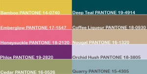
One place you can turn to is Pantone, known to all types of designers as the authority on color. Pantone’s Fall 2011 Color Report is one source for jewelry inspiration that will help you with your gift-giving this season, for a very simple reason: you’re not the only one using the Pantone color chart. Big clothing retailers across the country are referencing the same color chart! I’ve been seeing these colors come in to my local big-box stores since this spring, and I even have some shirts that exactly match Cedar, Coffee Liqueur, and Honeysuckle, and an Orchid Hush sweater (see chart below). So if you design using a color palette similar to Pantone’s Fall colors, you stand a very good chance to match or complement the wardrobe of the folks you’re giving gifts to! There’s nothing like opening a box of earrings and knowing with pleasure exactly which outfits will go with them!
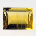
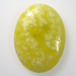
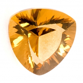
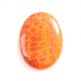
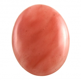
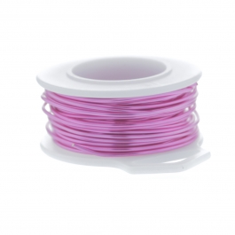
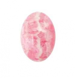
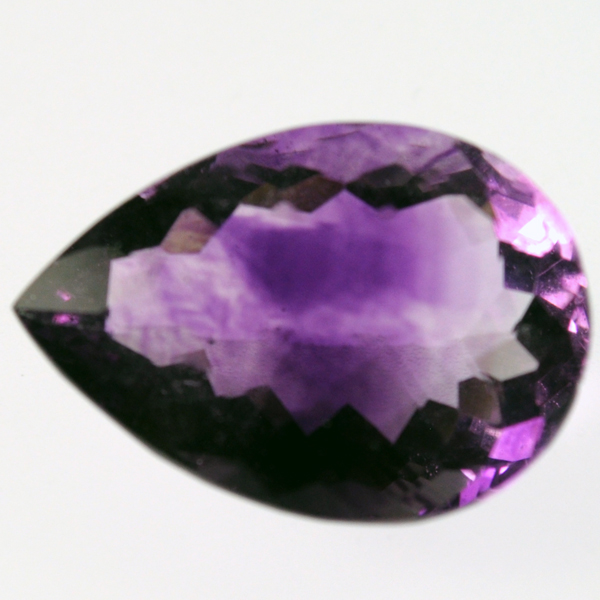
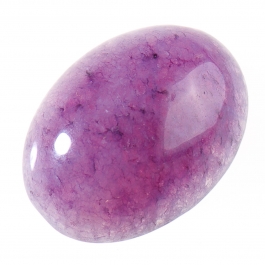
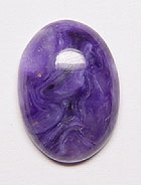
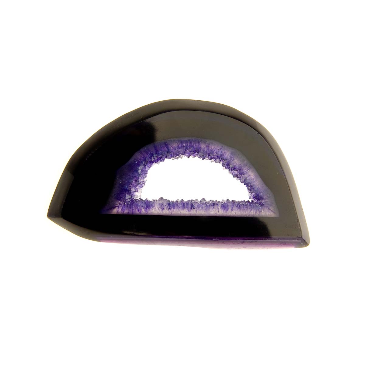
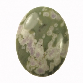
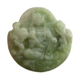
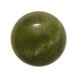
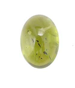
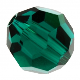
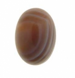
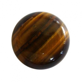
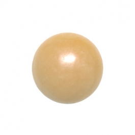
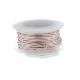
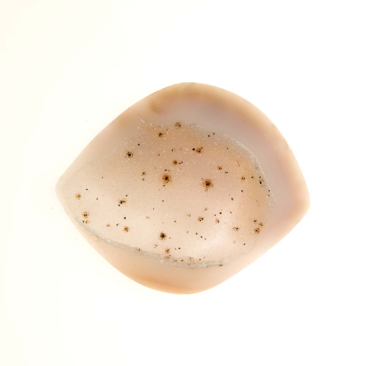
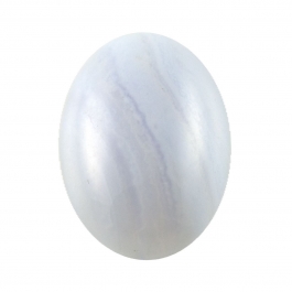
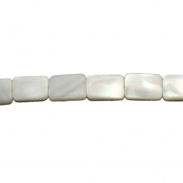
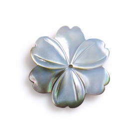
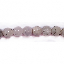
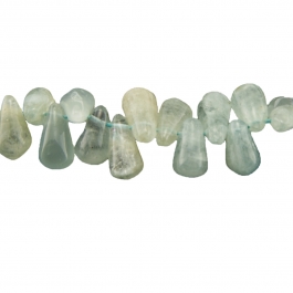
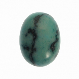
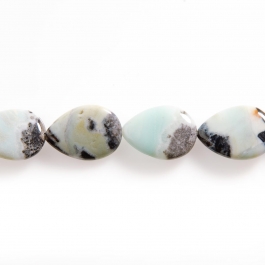
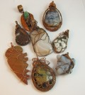
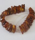
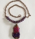
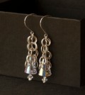
Here are some jewelry supplies I picked out from the Wire-Sculpture warehouse that follow the Pantone Fall 2011 Palette. Not all the colors are an exact match, but I really enjoyed putting together different color combinations I’d never thought of before! And some stones actually match several colors in the palette, like Fire Agate (Bamboo and Emberglow) and Sardonyx (Coffee Liqueur, Nougat, and Orchid Hush).
I hope this gives you some fresh new color ideas, and who knows, the earrings or pendant you make from this palette just might match your friend’s or your new wardrobe this season! Happpy creating, and let me know your favorites in the comments below!
Bamboo
Emberglow
Honeysuckle
Phlox
Cedar
Deep Teal
Coffee Liqueur
Nougat
Orchid Hush
Quarry
Have a Wire Jewelry Idea you’d like to share? Click Here to submit your idea. You could be featured on our Blog!
Click to Receive Daily Tips by Email




















Jil S
November 9, 2011 at 9:22 am
This is a GREAT piece of information to have. I just never know what people want in a given season. This really helps!
Thanks!
Carolyn Nau
November 9, 2011 at 9:34 am
Thank you…Without even knowing this I’ve been stocking up on Amethyst, chaorite for the first time ever, peridot, jades, and lots of amazonite, it comes in some interesting color variations. Just spent the weekend working with the bronze craft wire, love it. I don’t shop much, so tend to not pay that much attention to the trends, but surprisingly, these stones all go with the pallets I’ve been putting together for my jewelry. Other beautiful stones for amber glow would be sunstone and carnelian.
Teal and the blues also look for the fired agate being sold at the bead shows…this is one I prefer to buy in person because some of the strands aren’t at all well-matched, but they have some incredible choices.
Look for some amazing stone pendants in agate, many with some crystalization and druzy, super cheap $5 or so, ready to use as is, or dress up with a little wire.
Susan Puckett
November 9, 2011 at 10:38 am
This was a most helpful tip. Thank you
Lynne Hopkins
November 9, 2011 at 11:24 am
This is a great idea.
However, all my fall jewelry is completed because we are mid fall. How about some ideas for next spring and summer’s colors.
Thanks.
Rose
November 9, 2011 at 2:03 pm
Sure thing Lynne… I’m planning to do a post on spring colors soon! (And good for you for being ahead!)
Earnestine
November 9, 2011 at 12:51 pm
Thank you so much for this tip. I am going to print a copy and take it with me when I shop for beads.
Judi
November 9, 2011 at 2:14 pm
What a fabulous tip. I will definately be using this. Thank you.
Lynda
November 9, 2011 at 2:35 pm
When making things for mid- to late-season sales, I try to use colors that are transitional from the current season to the next. This way, the items work well with both seasons. Also, I pay attention to the more neutral tones and make several things in those since they are also good season-spanners.
Sherry
November 9, 2011 at 5:33 pm
This is wonderful Dale/Rose! This helps a lot!
Linda Keesee
November 10, 2011 at 9:40 am
Thank you, this is wonderful information to have. This will help me out when go shopping. With so many choices I never know what to buy when I get there.
Margaret Lakas
November 11, 2011 at 1:01 pm
I too recently learned of this company. I signed up for their information and they send me weekly emails. They apparently influence every aspect of life in terms of color. Paint mfg, furniture and just about everything. I’ve learned a lot about color through this company’s information to use in photography. Photoshop and some other photo software also use their color palate. How did you get the chart? I’ve only seen what they have for sale and they are very pricey! Thanks for the information and the chart.
dalecgr
November 11, 2011 at 5:19 pm
Well Margaret, Rose has her special ways!! It’s nice to have a copy of the chart though, glad you like it!
Rose
November 11, 2011 at 6:57 pm
Glad you liked the chart, Margaret! It’s simple to make charts like this in Photoshop. And yes – Pantone is surprisingly everywhere, if you’re looking for it
Denise
November 12, 2011 at 12:29 am
This is great information. As a graphic specialist, I am familiar with Pantone, in fact, if I’m trying to match colors, I’ll sometimes go to the “chip” book to try many different colors before going to the bead shop. Then I’m not flying blind. A few years back when my husband and I moved into a new house, I brought home a “chip” book and pulled colors of the carpet in different rooms. A big help when redecorating.
Nan
November 21, 2011 at 8:58 am
Another resource I use along with pantone are paint chips. You can go to any paint resource and get “Fall” fashion colors of course other seasons as well!